Transport for London, New fare advertisement, 2014

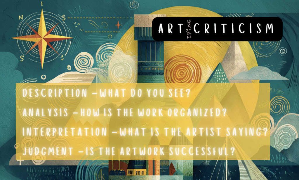
Description
The poster features a series of stylized trains, each painted in vibrant colors, arranged on a train track. The text “NEW FARES ARRIVE FEBRUARY 2014” is prominently displayed in large, three-dimensional letters. The design utilizes a playful, modern aesthetic, with the trains appearing to interact with the text. The background is a simple gray pavement, ensuring focus remains on the colorful elements.
Analysis
The use of bold typography and bright colors creates a sense of energy and excitement surrounding the announcement of new fares. The three-dimensional aspect of the letters gives depth, making the message feel dynamic. The positioning of the trains in relation to the text suggests movement and progress, symbolizing the transport system’s ongoing evolution. The minimalist background enhances the visual impact.
Interpretation
This poster communicates a fresh and approachable image for Transport for London, aiming to engage a broad audience. The playful arrangement of the trains and lettering implies that fare changes are not just routine updates but significant events worth celebrating. The vibrant colors can be interpreted as an invitation to explore the city, emphasizing the idea that public transport is integral to urban life.
Judgement
Overall, the poster is effective in conveying its message while being visually appealing. It successfully merges functionality with creativity, making it memorable. The design captures attention and promotes a positive perception of fare changes, encouraging public engagement. However, one could argue that the emphasis on playfulness may undermine the seriousness of fare increases, potentially confusing some viewers.


